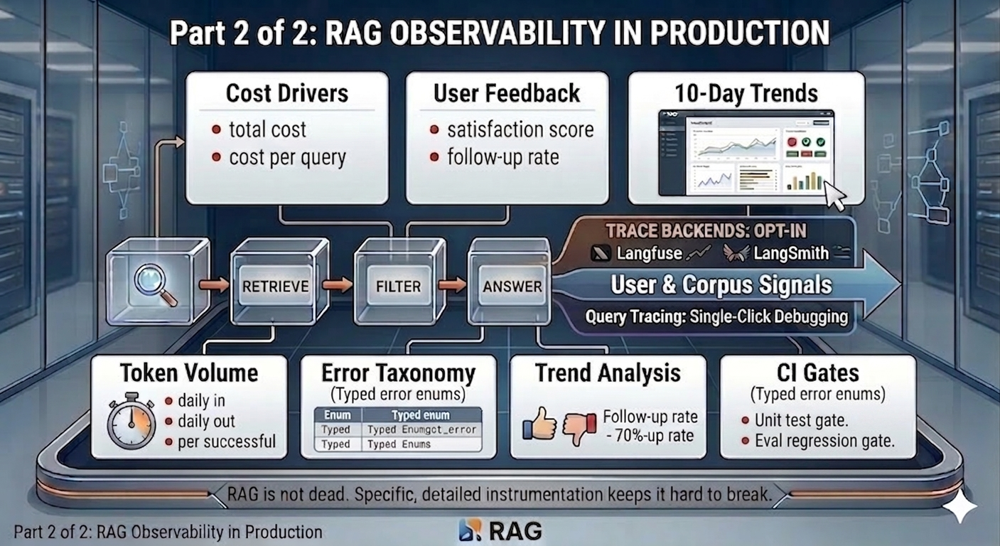
Part 2 of 2 - RAG is easy to measure. Harder to trust the measurements.
Cost compounds quietly. Users don’t explain why they stopped asking questions. Errors without a taxonomy are just noise. These are the observability layers that most RAG dashboards skip.
Picking up from Part 1
Part 1 covered the architecture, span tracing, and the four pipeline sections of the Vault dashboard: Performance, Retrieval Quality, Answer Quality, and Contextual Compression.
Those sections cover what the system did - how fast it responded, how well retrieval ranked, whether the LLM stayed within its evidence. They are about the pipeline’s behaviour.
This part covers what that behaviour cost, what users thought of it, and what broke. Then the 10-day trend view that turns a snapshot dashboard into a real monitoring tool, and the CI gates that ensure the signals themselves stay correct.
Section 5 - Cost & Efficiency
Screenshot: Cost & Efficiency section showing all four cost cards
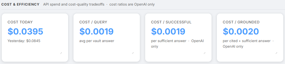
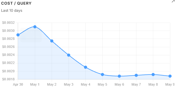
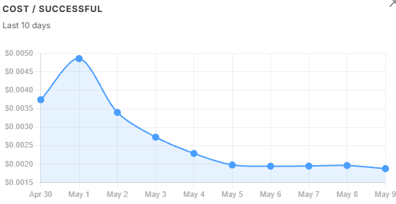
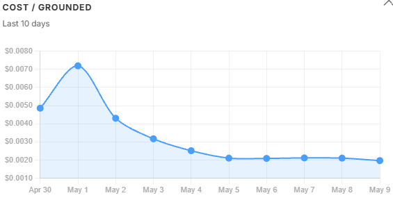
Raw cost is straightforward to track. The more useful question is cost per useful answer.
| Metric | What it tells us |
|---|---|
rag.cost.daily_usd | Total daily spend - shown alongside yesterday’s cost for comparison |
rag.cost.per_query_usd | Average cost per vault query |
rag.cost.per_successful_usd | Cost per sufficient answer - what is actually paid for a useful response |
rag.cost.per_grounded_usd | Cost per cited and sufficient answer - the tightest quality bar |
The gap between these three cost lines is the signal. When per_successful diverges from per_query, the corpus is failing to support answers - not the model, and not the prompt. The trend charts in Section 9 show exactly when and why that gap opened.
Note - Provider dependency: Cost metrics require LangChain’s OpenAI callback and return no value for Gemini queries. Token counts (Section 6) work across both providers and serve as the cost proxy for Gemini deployments.
rag.cost.daily_usd is also the one card that shows yesterday’s spend as a sub-label alongside today’s, giving an immediate day-over-day comparison without needing to open the trend chart.
Section 6 - Token Volume
Screenshot: Token Volume section showing Tokens In, Tokens Out, and Tokens/Successful
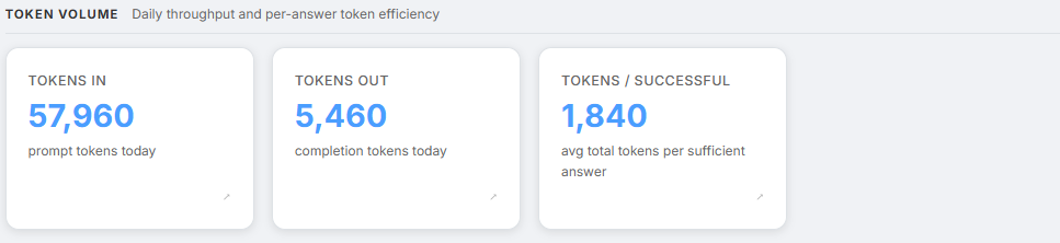
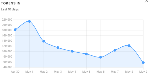
Token growth is the leading indicator of future cost growth. Token counts are available across all model providers - OpenAI and Gemini both.
| Metric | What it tells us |
|---|---|
rag.tokens.daily_in | Total prompt tokens today - context window and capacity planning |
rag.tokens.daily_out | Total completion tokens today - capacity planning |
rag.tokens.per_successful | Average total tokens per sufficient answer - token efficiency signal |
tokens.per_successful is the token equivalent of cost.per_successful. It works even when cost tracking is unavailable - useful during Gemini deployments where the per-call cost callback does not fire.
Two patterns worth watching:
A rising tokens_in with a flat or falling tokens.per_successful is a healthy sign - more queries are being handled without inflating context per query.
The reverse - rising tokens_in with rising tokens.per_successful - means retrieved contexts are getting longer. That usually points to chunks being too large, or too many chunks surviving the filter.
Section 7 - User Feedback
Screenshot: User Feedback section showing Satisfaction score and Follow-up Rate, with 👍👎 buttons visible in a chat below
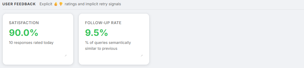
Everything in Sections 1–6 comes from the pipeline itself. Those metrics cover how the system behaved. They do not cover whether the user found the answer useful.
Two explicit signals close that gap directly, with the LLM-as-judge faithfulness score from Section 3 completing the picture.
| Metric | What it tells us |
|---|---|
rag.user.satisfaction_score | Fraction of 👍 from explicit ratings - direct quality signal |
rag.query.follow_up_rate | Fraction of vault queries semantically similar to the previous one - implicit retry signal |
Colour thresholds:
- Satisfaction: green above 80%, yellow above 60%, red below 60%
- Follow-up rate: green below 15%, yellow below 35%, red above 35%
Explicit ratings. After every vault response, 👍/👎 buttons appear inline, tied to the specific trace ID. A click fires POST /chat/feedback, which records the score in Firestore against the matching message and feeds it into the aggregator.
A satisfaction score below 60% is a red flag even if citation coverage looks healthy - the system is producing grounded answers that users still find unhelpful. A very low rated_count is also a signal in itself. When users are not engaging with the feedback buttons at all, responses may be getting abandoned before they are read.
Implicit follow-up detection. A closely related follow-up question immediately after a response is a soft signal the previous answer was incomplete. The system computes cosine similarity between successive query embeddings - reusing embeddings already generated for retrieval, so there is zero extra API cost. A similarity score at or above 0.70 flags the query as a follow-up. Time windows are deliberately ignored: voice users and fast typists would produce false positives with any time-based threshold. 0.70 was empirically chosen to balance semantic sensitivity against false positives.
LLM-as-judge faithfulness. The rag.answer.grounded_score covered in Section 3 of Part 1 belongs to Answer Quality, not User Feedback - but it is the third signal in the triangulation. Explicit ratings measure whether users agreed. Follow-up rate measures whether users needed more. Grounded score measures whether the answer earned their agreement by staying within the evidence.
Three signals, three angles on the same question:
satisfaction_score- whether users agreed with the answerfollow_up_rate- whether users needed more after the answeranswer.grounded_score- whether the answer earned their agreement by staying within the evidence
Section 8 - Errors Today
Screenshot: Errors Today section showing the error taxonomy table with counts
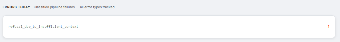
Unclassified errors are useless for debugging. An error logged as “something went wrong” gives no indication of where in the pipeline to look or what to change. The Vault uses a typed enum:
class RagErrorType(str, Enum):
    embedding_failure              # Embedding model unreachable
    retrieval_timeout              # pgvector query timed out
    llm_timeout                   # LLM inference timed out
    llm_rate_limit                # OpenAI 429
    structured_output_parse_fail  # Pydantic validation of LLM output failed
    citation_validation_fail      # LLM cited a non-existent chunk index
    refusal_due_to_insufficient_context  # Out-of-distribution query
    ingest_extraction_fail        # Document reader failed at upload time
    unknown
Each error type identifies where in the pipeline the problem is. A spike in structured_output_parse_fail means the answer LLM is not following its output schema - the prompt needs inspection. A spike in citation_validation_fail means the model is hallucinating citation indices - that warrants a retrieval quality audit, not a prompt fix.
The dashboard shows a green checkmark when there are no errors today, and a sorted list by count when there are. Error counts also trigger SRE alerts - a sustained error rate above 5% fires a Gmail notification with the full metrics snapshot, as described in the alerting layer in Part 1.
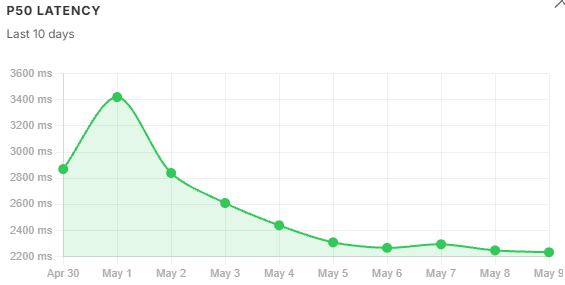
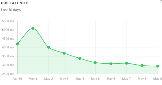
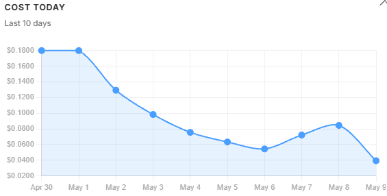
The 10-day trend view
The dashboard became genuinely useful only when the team stopped looking at single-day metrics. Snapshots explain incidents. Trends explain systems. Clicking opens a modal with a 10-day line chart for that metric, pre-fetched in the background so the first click is instant.
A single-day reading is a snapshot. Ten days of readings is a monitoring tool. A P95 of 4,950 ms in isolation is ambiguous - the trend chart shows immediately whether that number is flat, climbing, or recovering from a spike.
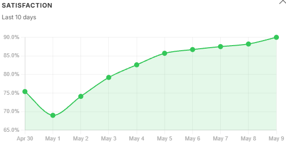
The chart uses the same colour semantics as the card - green for metrics in the healthy band, yellow for warning. A declining top1_similarity trend carries more diagnostic weight than a single-day reading below threshold - it means retrieval is getting structurally worse, not just experiencing a noisy day. A satisfaction_score falling week over week - even if still in the yellow band - is a stronger signal than a single low reading.
Trend data is read directly from Firestore across the past 10 days’ per-user metric documents. Days with no vault queries show as gaps in the chart, making it immediately obvious whether a metric dropped or whether the system simply was not used that day.
Latency trends. P50 tracks query volume loosely. P95 is more sensitive - it follows context window size, not just volume. Both peaked on May 1, but P95 degraded faster than P50 because oversized chunks amplified the long-tail inference cost.
Cost trends. daily_usd held flat across the two peak-volume days then fell steadily through recovery - total spend barely moved while quality collapsed. cost_per_query told a similar story. cost_per_successful and cost_per_grounded told a different one: they spiked sharply on May 1 because the refusal rate hit 36%, meaning the same total spend was being divided across far fewer qualifying answers. A widening gap between these three lines is a corpus signal, not a prompt signal - the model is not misbehaving, the retrieved context is failing to support a sufficient answer. By May 5, with the filter tightened, all three lines had converged again.
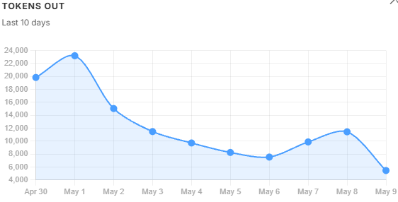
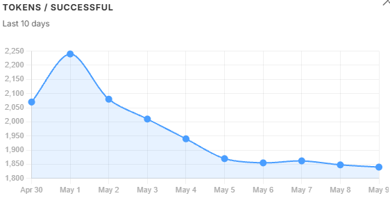
Token volume trends. tokens_in and tokens_out follow query volume - when usage drops, they drop. tokens_per_successful does not follow that pattern. It kept climbing even as volume fell, because oversized chunks were inflating the context window on every query regardless of how many queries there were. That divergence is the diagnostic: volume alone would not have explained the cost problem, but tokens_per_successful did. It peaked on May 1 and recovered steadily once the filter threshold was tightened the following day.
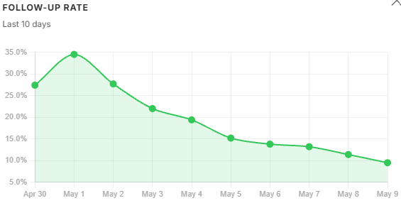
User feedback trends. Satisfaction fell and follow-up rate climbed in lockstep with tokens_per_successful - not with query volume. Users were getting longer, noisier answers and asking the same question again. Both signals began recovering the day after the filter was adjusted, which is the clearest possible confirmation that the filter change was the right fix. rated_count tracked volume through the same period, meaning engagement held steady while quality fell - the satisfaction drop was real, not an artefact of fewer users clicking through.
Testing - hard gates in CI
Observability means nothing if the code producing the signals is wrong.
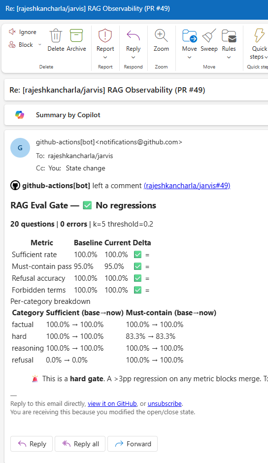
The CI pipeline has two hard gates on every pull request.
Unit test gate. Runs pytest with no live API calls - everything is mocked. Covers:
test_alerting.py: 11 tests across threshold checks, SMTP emission, cooldown logic, and Firestore failure handlingtest_chunk_filter.py: keyword extraction, pinning logic, LLM fallback on failuretest_retriever.py: 1-based citation index assignment, prompt format, citations payload serialisationtest_answer.py: structured output parsing, citation validation (valid / partial / fully invalid)
If any unit test fails, the PR cannot merge.
Eval regression gate. A separate job runs a checked-in golden evaluation set against the actual retrieval and answer pipeline. If accuracy drops by more than 3 percentage points relative to the main branch baseline, the job fails and posts a detailed report as a PR comment.
This catches regressions that unit tests cannot - changes to chunking parameters, prompt rewrites, similarity threshold adjustments that look correct in isolation but degrade end-to-end quality. The eval gate comment on every PR makes retrieval quality a visible, reviewable artefact rather than an invisible assumption.
What I would consider further
The current stack covers the full lifecycle from retrieval through user feedback. Three gaps remain visible from inside the running system - not as theory, but as questions the dashboard currently cannot answer.
Chunk freshness tracking. The dashboard surfaces retrieval quality but not retrieval age. Tagging each chunk with its ingest timestamp and tracking the age distribution of top-k results would give a leading indicator of stale retrieval - one that surfaces before the refusal rate has had time to climb.
Query length distribution. Short queries (under 50 characters) tend to have lower retrieval quality - they are ambiguous and resist HyDE expansion. Bucketing queries by length and correlating with satisfaction and citation coverage would reveal whether short-query handling needs targeted work. The signals are already in the pipeline; the bucketing is not.
Per-document retrieval heatmap. Documents retrieved often but cited rarely are low-quality matches - candidates for re-chunking or removal. Citation indices are already recorded per query; aggregating them across queries to produce a per-document signal is the missing step.
Two longer-horizon items are on the list but need weeks of data to be meaningful: an embedding drift score comparing today’s query centroid against a stored baseline, and explicit Δ% labels on every metric card so trend signals surface on the dashboard without needing to open the trend modal.
The core lesson
Building RAG for a demo takes an afternoon. The retrieval works. The answers look reasonable. The demo goes well.
Building RAG for production means accepting that retrieval quality is a continuous variable, not a switch. It drifts. Context relevance slips. Costs compound. Errors accumulate without classification. None of these announce themselves - they require instrumentation to surface.
The stack described across these two posts - span tracing with a frozen contract, per-user metrics aggregation with a read-then-merge flush, structured error taxonomy, SRE alerting with cooldown, an eight-section dashboard with 10-day trend charts, explicit user feedback wired to trace IDs, semantic follow-up detection, an LLM-as-judge faithfulness scorer, and CI gates on both unit correctness and end-to-end retrieval quality - did not emerge all at once. It emerged because each production incident revealed exactly which signal was missing.
Build the signals before the incidents. Trust is harder to rebuild than observability is to add.
NB: All the metrics defined in this blog are taken from my personal AI assistant I have been building on Google Cloud Run, with integrations for Google Workspace, Microsoft 365 and a full RAG pipeline. The observability stack described here is live and handling real queries.